Once you finish here. You will never be able to UnKnow it.
1


THIS HAS BECOME THE MOST RECOGNIZED HUMAN GESTURE IN THE U.S.A.




IT ALSO DEMONSTRATES THE POOR EDUCATIONAL MENTALITY OF EVERYDAY LIFE IN THE U.S.A.
(The 4 Examples Above Are For The Hearing Impaired, And Lowest I.Q.)
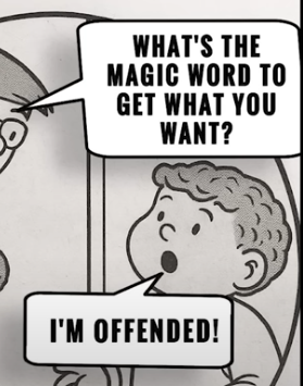
In America Today. Everyone is either Angry, Insulted, Offended, Upset, Bothered, Agrivated, Uncomfortable, or


THIS HAS BECOME THE MOST RECOGNIZED HUMAN GESTURE IN THE U.S.A.


IT ALSO DEMONSTRATES THE POOR EDUCATIONAL MENTALITY OF EVERYDAY LIFE IN THE U.S.A.
(The 4 Examples Above Are For The Hearing Impaired, And Lowest I.Q.)
In America Today. Everyone is either Angry, Insulted, Offended, Upset, Bothered, Agrivated, Uncomfortable, or
1a

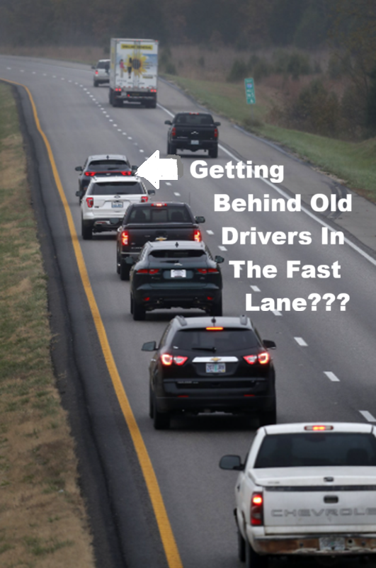
This is for all of those drivers who have been behind me in my 2000 Ranger.
I am at the late, prime of my life at almost 79. Some of you have probably seen me going the posted speed limit.
Yes. I'm that old guy you hate to follow. But I avoid the fast lane so I can watch all of you break the speed limit, and get stopped up ahead by a cop, for speeding, or reckless driving you did...because you were pissed off at me.
1b

Saying It For You One of the most rewarding, and comical discoveries I have made since becoming an American, Senior Citizen is; how terrific it feels, not to be concerned about what anybody else thinks of me, or what I can say, without fearing some kind of instant retribution from anyone I don’t know, or do know. Being almost eighty in a few years. My days of retirement have become my newest, and most rewarding source of learning. In fact. Since I retired from the navy in 1995. With the advent of the Internet nearly taking control of everything anybody does. I feel more able to understand how the World really works by becoming more educated. If only I had been as fortunate to have access to all of the information when I was younger. I have no idea what my future might have been. Though I feel more educated, and informed now. Every day has become a new introduction to the way human beings treat one-another, both in good, and terrible ways. At my age. Having so much time to devote to improving myself. I have become a voracious reader, and devote many hours a day just watching YouTube Videos that go from entertainment, to news, History, and countless other topics I never had time to see when I was still working, after leaving the navy. Because I have collected so much information since retiring. I find myself wondering how, and where to begin sharing so much with you; almost...I imagine, as somewhat of a mini-High School, or College curriculum devoted to introducing common Americans to much of the needed education they may have missed, or were never taught because of poor educational advantages, or poor teaching, and instructors. It took me many years to finally understand what Wisdom was as a young man. Jokingly. I thought I would need to visit every dentist in my hometown, and collect all of the Wisdom Teeth the dentists had extracted in order to get real wisdom from others. My biggest surprise, and disappointment as a senior citizen with so much access to the Internet, and watching YouTube videos...has been seeing how terrible our American educational system is, and is becoming worse with every day that passes. I discovered a string of videos created by a large group of people from all walks of life in America who call themselves FIRST AMENDMENT AUDITORS. Thankfully. Their number is growing as they visit various locations where public access is permitted, outside of private areas where so many uninformed, almost illiterate sounding people have declared that THE HUMAN EYE and the camera in front of it….ARE ILLEGALLY taking pictures that violate the personal privacy rights so many are convinced they have, out in public. What they all, do not know, is that there IS NO EXPECTATION OF PRIVACY IN PUBLIC. Proven hundreds of times, every day, wherever anyone goes. There are cameras watching ALL OF US everywhere, all the time. If you decide to watch any YouTube videos. You will find how so many uninformed, nearly paranoid people get so upset with someone taking their picture, or a video...They Instantly dial 911. Most of the videos are really funny, and sad at the same time. If those 1st Amendment Auditors are able to catch so many people who equally share their ignorance of their freedoms, rights, and liberties...as shown. No wonder this country is so screwed-up with about 150 million Americans who never finished school, or just didn’t want to pay attention while they were taking up time in school. As a retired Navy veteran who gave better than half of my life to the country I love, serving in uniform. I really find myself at a loss, trying to understand how the Greatest Nation on Earth can be so far behind in education? In many cases. We as a nation are sometimes less educated than some 3rd World nations in many ways. And that hurts me!

Saying It For You One of the most rewarding, and comical discoveries I have made since becoming an American, Senior Citizen is; how terrific it feels, not to be concerned about what anybody else thinks of me, or what I can say, without fearing some kind of instant retribution from anyone I don’t know, or do know. Being almost eighty in a few years. My days of retirement have become my newest, and most rewarding source of learning. In fact. Since I retired from the navy in 1995. With the advent of the Internet nearly taking control of everything anybody does. I feel more able to understand how the World really works by becoming more educated. If only I had been as fortunate to have access to all of the information when I was younger. I have no idea what my future might have been. Though I feel more educated, and informed now. Every day has become a new introduction to the way human beings treat one-another, both in good, and terrible ways. At my age. Having so much time to devote to improving myself. I have become a voracious reader, and devote many hours a day just watching YouTube Videos that go from entertainment, to news, History, and countless other topics I never had time to see when I was still working, after leaving the navy. Because I have collected so much information since retiring. I find myself wondering how, and where to begin sharing so much with you; almost...I imagine, as somewhat of a mini-High School, or College curriculum devoted to introducing common Americans to much of the needed education they may have missed, or were never taught because of poor educational advantages, or poor teaching, and instructors. It took me many years to finally understand what Wisdom was as a young man. Jokingly. I thought I would need to visit every dentist in my hometown, and collect all of the Wisdom Teeth the dentists had extracted in order to get real wisdom from others. My biggest surprise, and disappointment as a senior citizen with so much access to the Internet, and watching YouTube videos...has been seeing how terrible our American educational system is, and is becoming worse with every day that passes. I discovered a string of videos created by a large group of people from all walks of life in America who call themselves FIRST AMENDMENT AUDITORS. Thankfully. Their number is growing as they visit various locations where public access is permitted, outside of private areas where so many uninformed, almost illiterate sounding people have declared that THE HUMAN EYE and the camera in front of it….ARE ILLEGALLY taking pictures that violate the personal privacy rights so many are convinced they have, out in public. What they all, do not know, is that there IS NO EXPECTATION OF PRIVACY IN PUBLIC. Proven hundreds of times, every day, wherever anyone goes. There are cameras watching ALL OF US everywhere, all the time. If you decide to watch any YouTube videos. You will find how so many uninformed, nearly paranoid people get so upset with someone taking their picture, or a video...They Instantly dial 911. Most of the videos are really funny, and sad at the same time. If those 1st Amendment Auditors are able to catch so many people who equally share their ignorance of their freedoms, rights, and liberties...as shown. No wonder this country is so screwed-up with about 150 million Americans who never finished school, or just didn’t want to pay attention while they were taking up time in school. As a retired Navy veteran who gave better than half of my life to the country I love, serving in uniform. I really find myself at a loss, trying to understand how the Greatest Nation on Earth can be so far behind in education? In many cases. We as a nation are sometimes less educated than some 3rd World nations in many ways. And that hurts me!
1bb

WE AMERICANS HAVE BEEN SPOILED INTO PURE STUPIDTY.
So, like it or not. My intention here is to EDUCATE the millions of Americans who have no idea about the 5 phases of the 1st AMENDMENT
That allows them the rights, and freedoms to be Americans. Unlike so many other nations where SPEAKING gets people killed.
Too many Americans are so disinformed, and uninformed today, which creates an atmosphere of anger, hostility, distrust, and division
that actually pits Americans against Americans...based on hatred, and ignorance.
Democrats confuse FREE SPEECH with the Right to be IDIOTS.- Newt Gingrich.
1c

Most forms of Education in America today has been replaced by a shortened (abbreviated) list of swear words, and a famouse, One Finger gesture aimed at others in anger. While our electronic life of cellphones has nearly eliminated any need for more than one person to actually have a live conversation with any other person, or persons...as long as the batteries last.
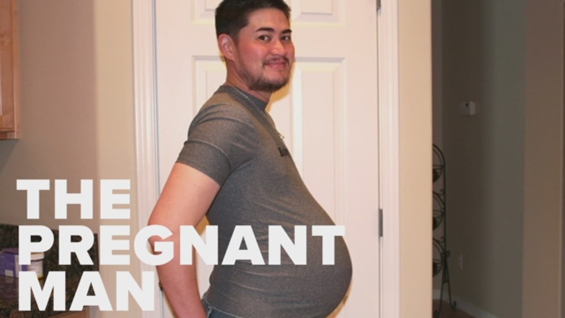
Can you honestly believe you are living in the twenty-first century, and there are all sorts of people around you who think they are smarter than you? Here we are near the end of the first quarter of the twenty-first century, and those people who claim to be smarter than you, think, and brag about...of all things... how men can have babies, while a large number of people who live around us are also convinced boys, and men who pretend to be girls, and women...should be able to play in girls, and women’s sports... just to be fair to the wannabe girls who can stand up, and pee.
Being in my late seventies. I’ve seen much of the World thanks to being a sailor in the U.S. Navy. I’ve also seen much of our own country over the years, and as I got older.
Learned not to be as trusting of strangers; even if they smile, say hello, or happen to be in cars around me.
I don’t think I’m any different than millions of other Americans these days.
At least not different enough to understand when somebody waves that magical...ONE FINGER SALUTE at me because I got in their way, looked at them wrong, said something they didn’t like...or, as in this case: Wrote words that made them wish I was close enough for them to punch.
So, after experiencing so many of those ONE FINGER JOBS. I decided. Rather than doing the same thing back at whoever gave me that ONE FINGER. I would tell myself to just smile, thank them if they could hear me, and ask...”IS THAT YOUR “IQ” or YOUR MENTAL AGE? But there are better things you can say instead of the “IQ” question. Thank them and smile as you say...”SO YOU THINK I AM NUMBER 1?”
2

There’s also a very famous, constantly used set of swear words made famous by the late comedian, George Carlin, who first used Seven words you can’t say on television.
But he was sued for using them. Long before one word, in particular, became a verbal tool with four letters that invite one human to do something to other humans...normally engaged in by a man, and a woman.
Of course. I don’t need to lower my personal standards to use that word here. But to anyone who has never heard it, written, or used it. Somebody you know will happily inform you if you ask them what that word is...carefully.
In my opinion now. I am convinced how one event has helped to destroy nearly everything we all used to know as being a Friendly American. Namely...it seems one-on-one human conversations have been replaced with electronic devices like Cellphones that contain a tiny keyboard. And that keyboard helps make it’s owner rather lazy in many ways. Not to mention how only typing abbreviated words...the Cellphone picks, rather than the user. No human contact is required. So users lose the ability to both spell, and talk the way humans once did...before Everyone Owned a Phone without wires.
Above all of what I have talked about so far. I just reminded myself of several topics I cannot ignore. Topics I will make as a prerequisite of things we all should keep in mind as you read. They may sound confusing, but their connections will become more familiar as I go on. Money, Education, Power, Control, Politics, Corruption. Those are only a few. But I will demonstrate how each and every one of them are connected. Also as topics meant to be ignored by those who need to get the Control of Power over the American Taxpayers.
Before long, as you continue to read. TWO topics will be the leaders of the combined achievement of Control and Power. Education, Drugs, and Money.
Nothing that takes place, anywhere in the United States of America, or around the World, is done without the underlying word Money.
For as long as I can remember. Back to the 1950’s, when I started elementary school in my hometown. Someone; I think, was either my father, or a teacher, who always seemed to blame everything on money.
As they said it...”Money is the root of all evil.” And to this day. Whether those words were correct, or not. I have never met anyone in my entire life who hasn’t said they believed that wasn’t true about money. One other thing before we get started. I honestly do not care what anyone calls me, thinks about me, wants to do to me, or thinks they can control me. I have been called all of the following names. So, for anyone who wants to accuse me of Anything. Here’s your chance.
3

Some people who will visit here are convinced THE WORLD REVOLVES AROUND THEM.
They are the "ME" & "I" generation of selfishness, being spoiled, irresponsible...for their own lives.
Because THEY are SO SPECIAL in their own eyes. They refuse to accept RIGHT or WRONG, TRUTH over LIES, EDUCATION over IGNORANCE.
4

As a senior citizen. ICANSAYIT has many free hours to spend on the Internet, watching YOUTUBE video's
that have become more educational, than entertaining.
Not surprisingly. I have discovered how actual homegrown enemies of other Americans;
(known as Radical Democrats) with a following of proven, uneducated members of Congress will do, and have been doing everything
they can to Avoid allowing the American people have access to, or hear the TRUTH.
By watching YouTube video's. I have seen how ignorant so many fellow Americans really are.
For Example: Some people standing on Private Property are under the impression that Taking Pictures, or Video's of Private Property
From Public area's is ILLEGAL. Of course. That is not true. Since you cannot PREVENT HUMAN EYES from seeing Private Property.
5

MONEY AND POLITICS RUN AMERICA.
The use of language, and words designed to be above the intelligence level of most Americans, is how the Corrupt manage to control, and have so much power over WE THE PEOPLE.
Govt. control of education makes it nearly certain that the uneducated will always follow the corrupt, since they are dependent upon the corrupt to survive.
6

This topic is about those Americans who claim to have terrible, or short memories.
So they instantly, normally generally admit..."I have a short memory, and can't remember almost everything.
But. Until I can prove they always use the excuse. I can instantly prove them wrong in seconds.
I learned it from trying to educate my son's as they were going to school. It's a simple method my father taught me, back in the late 1950's when I first began learning the TIMES TABLES on a daily basis, at home, on our dining room table, after dinner had been cleared.
7

At my age today. Knowing my months, weeks, and days are numbered. I often remind myself
and remember. Since I like to always be in charge of everything. The one thing I know, will really piss me off is:
I won't know it when my heart stops, and I exhale for the last time. That's really a bummer since I know I won't
be around at my wake, to hear what people get to say about me. So I wonder ahead of time if, maybe...I should ask people to come to my home, and share what they like, and don't like about me before I become "Worm Dirt".
8


9


10


11


12


13


14


15


16


17


18


19


20


21


22


23


24


25


26


27


28


29


30


31


32


33


34


35


36


37


38


39


40


100







 2025-12-22 01:55 88K
 2025-12-22 01:55 184K
 2025-12-22 01:56 286K
 2025-12-22 01:56 158K
 2025-12-22 01:58 72K
///////////////////////////////////////////////////////////////////////
 2025-12-22 01:52 256K
 2025-12-22 01:52 232K
 2025-12-22 01:52 48K
 2025-12-22 01:52 147K
 2025-12-22 01:52 448K
 2025-12-22 01:52 12K
 2025-12-22 01:52 107K
 2025-12-22 01:52 293K
 2025-12-22 01:52 842K
 2025-12-22 01:52 118K
 2025-12-22 01:52 97K
 2025-12-22 01:52 399K
 2025-12-22 01:52 1.2K
 2025-12-22 01:52 2.4K
 2025-12-22 01:52 7.1K
 2025-12-22 01:52 152K
 2025-12-22 01:52 152K
 2025-12-22 01:52 37K
 2025-12-22 01:52 81K
 2025-12-22 01:52 35K
 2025-12-22 01:52 41K


 2025-12-22 01:52 130K
 2025-12-22 01:52 56K
 2025-12-22 01:52 224K
 2025-12-22 01:52 206K
 2025-12-22 01:52 156K
 2025-12-22 01:52 9.2K
 2025-12-22 01:52 32K
 2025-12-22 01:52 891K

 2025-12-22 01:52 45K
 2025-12-22 01:52 557K
 2025-12-22 01:52 104K
 2025-12-22 01:52 76K
 2025-12-22 01:52 109K
 2025-12-22 01:52 265K
 2025-12-22 01:52 359K
 2025-12-22 01:52 364K
 2025-12-22 01:52 54K
 2025-12-22 01:52 248K
 2025-12-22 01:52 474K
 2025-12-22 01:52 235K
 2025-12-22 01:52 202K
 2025-12-22 01:52 287K
 2025-12-22 01:52 418K
 2025-12-22 01:52 14K
 2025-12-22 01:52 61K
 2025-12-22 01:52 203K
 2025-12-22 01:52 151K
 2025-12-22 01:52 11K
 2025-12-22 01:52 104K
 2025-12-22 01:52 84K


 2025-12-22 01:52 15K
 2025-12-22 01:53 45K
 2025-12-22 01:53 93K
 2025-12-22 01:52 67K
 2025-12-22 01:52 170K
 2025-12-22 01:52 122K
 2025-12-22 01:53 237K
 2025-12-22 01:53 38K
 2025-12-22 01:53 164K
 2025-12-22 01:53 353K
 2025-12-22 01:53 251K
 2025-12-22 01:53 46K
 2025-12-22 01:53 74K
 2025-12-22 01:53 128K
 2025-12-22 01:53 49K
 2025-12-22 01:53 147K
 2025-12-22 01:53 48K
 2025-12-22 01:53 218K
 2025-12-22 01:53 95K
 2025-12-22 01:53 77K
 2025-12-22 01:53 408K
 2025-12-22 01:53 41K
 2025-12-22 01:53 35K
 2025-12-22 01:53 126K
 2025-12-22 01:53 80K
 2025-12-22 01:53 128K
 2025-12-22 01:53 87K
 2025-12-22 01:53 72K
 2025-12-22 01:53 367K

 2025-12-22 01:53 158K
 2025-12-22 01:53 28K
 2025-12-22 01:53 58K
 2025-12-22 01:53 57K
 2025-12-22 01:53 297K
 2025-12-22 01:53 28K
 2025-12-22 01:53 153K
 2025-12-22 01:53 540K
 2025-12-22 01:53 142K
 2025-12-22 01:53 184K
 2025-12-22 01:53
 2025-12-22 01:53 290K
 2025-12-22 01:53 413K
 2025-12-22 01:53 321K
 2025-12-22 01:53 611K
 2025-12-22 01:53 316K
 2025-12-22 01:53 317K
 2025-12-22 01:53 132K
 2025-12-22 01:53 557K
 2025-12-22 01:53 119K
 2025-12-22 01:53 35K
 2025-12-22 01:53 9.5K
 2025-12-22 01:53 685K
 2025-12-22 01:53 306K
 2025-12-22 01:53 216K
 2025-12-22 01:53 18K
 2025-12-22 01:53 7.4K
 2025-12-22 01:53 29K
 2025-12-22 01:53 23K
 2025-12-22 01:53 135K
 2025-12-22 01:53 132K
 2025-12-22 01:53 271K
 2025-12-22 01:53 11K
 2025-12-22 01:53 838K
 2025-12-22 01:53 183K
 2025-12-22 01:53 212K
 2025-12-22 01:53 107K
 2025-12-22 01:53 233K
 2025-12-22 01:53 159K
 2025-12-22 01:53 247K
 2025-12-22 01:53 356K
 2025-12-22 01:53 48K
 2025-12-22 01:53 169K
 2025-12-22 01:53 575K
 2025-12-22 01:53 82K
 2025-12-22 01:53 85K
 2025-12-22 01:53 59K
 2025-12-22 01:53 297K
 2025-12-22 01:53 27K
 2025-12-22 01:53 269K
 2025-12-22 01:53 185K
 2025-12-22 01:53 54K
 2025-12-22 01:53 67K
 2025-12-22 01:53 182K
 2025-12-22 01:53 74K
 2025-12-22 01:53 35K
 2025-12-22 01:53 55K
 2025-12-22 01:53 42K
 2025-12-22 01:53 13K
 2025-12-22 01:53 86K
 2025-12-22 01:53 23K
 2025-12-22 01:53 22K
 2025-12-22 01:53 26K
 2025-12-22 01:53 316K
 2025-12-22 01:53 409K
 2025-12-22 01:53 43K
 2025-12-22 01:53 195K
 2025-12-22 01:53 877K
 2025-12-22 01:53 906K
 2025-12-22 01:53 16K
 2025-12-22 01:53 48K
 2025-12-22 01:53 91K
 2025-12-22 01:53 68K
 2025-12-22 01:53 290K
 2025-12-22 01:53 204K
 2025-12-22 01:53 347K
 2025-12-22 01:53 89K
 2025-12-22 01:53 76K
 2025-12-22 01:53 55K
 2025-12-22 01:53 166K
 2025-12-22 01:53 120K
 2025-12-22 01:53 159K
 2025-12-22 01:53 73K
 2025-12-22 01:53 105K


 2025-12-22 01:53 53K
 2025-12-22 01:53 312K
 2025-12-22 01:53 289K
 2025-12-22 01:53 18K
 2025-12-22 01:53 257K
 2025-12-22 01:53 299K
 2025-12-22 01:53 15K
 2025-12-22 01:53 39K
 2025-12-22 01:53 106K
 2025-12-22 01:53 134K
 2025-12-22 01:53 8.8K
 2025-12-22 01:53 214K
 2025-12-22 01:53 106K
 2025-12-22 01:53 148K
 2025-12-22 01:53 425K
 2025-12-22 01:53 38K
 2025-12-22 01:53 121K
 2025-12-22 01:53 61K
 2025-12-22 01:53 30K
 2025-12-22 01:53 6.8K
 2025-12-22 01:53 307K
 2025-12-22 01:53 56K
 2025-12-22 01:53 153K
 2025-12-22 01:53 356K
 2025-12-22 01:53 45K
 2025-12-22 01:53 136K
 2025-12-22 01:53 84K
 2025-12-22 01:53 162K
 2025-12-22 01:53 172K
 2025-12-22 01:53 104K
 2025-12-22 01:53 75K
 2025-12-22 01:53 235K
 2025-12-22 01:53 150K
 2025-12-22 01:53 157K
 2025-12-22 01:53 74K
 2025-12-22 01:53 26K
 2025-12-22 01:53 220K
 2025-12-22 01:53 18K
 2025-12-22 01:53 63K
 2025-12-22 01:53 14K
 2025-12-22 01:53 11K
 2025-12-22 01:53 36K
 2025-12-22 01:54 71K
 2025-12-22 01:54 285K
 2025-12-22 01:54 137K
 2025-12-22 01:54 324K
 2025-12-22 01:54 174K
 2025-12-22 01:54 251K
 2025-12-22 01:54 86K
 2025-12-22 01:54 128K
 2025-12-22 01:54 148K
 2025-12-22 01:54 65K
 2025-12-22 01:54 87K
 2025-12-22 01:54 17K
 2025-12-22 01:54 186K
 2025-12-22 01:54 41K
 2025-12-22 01:54 89K
 2025-12-22 01:54 605K
 2025-12-22 01:54 178K
 2025-12-22 01:54 126K
 2025-12-22 01:54 67K
 2025-12-22 01:54 6.1K
 2025-12-22 01:54 207K
 2025-12-22 01:54 41K
 2025-12-22 01:54 37K
 2025-12-22 01:54 34K
 2025-12-22 01:54 29K
 2025-12-22 01:54 34K
 2025-12-22 01:54 176K
 2025-12-22 01:54 16K
 2025-12-22 01:54 157K
 2025-12-22 01:54 204K
 2025-12-22 01:54 19K
 2025-12-22 01:54 67K
 2025-12-22 01:54 204K
 2025-12-22 01:54 37K
 2025-12-22 01:54 136K
 2025-12-22 01:54 46K
 2025-12-22 01:54 105K
 2025-12-22 01:54 464K
 2025-12-22 01:54 617K
 2025-12-22 01:54 64K
 2025-12-22 01:54 14K
 2025-12-22 01:54 6.6K
 2025-12-22 01:54 52K
 2025-12-22 01:54 41K
 2025-12-22 01:54 31K
 2025-12-22 01:54 33K
 2025-12-22 01:54 155K
 2025-12-22 01:54 54K
 2025-12-22 01:54 460K
 2025-12-22 01:54 6.2K
 2025-12-22 01:54 839K
 2025-12-22 01:54 12K
 2025-12-22 01:54 78K
 2025-12-22 01:54 73K
 2025-12-22 01:54 199K
 2025-12-22 01:54 95K
 2025-12-22 01:54 174K
 2025-12-22 01:54 568K
 2025-12-22 01:54 53K
 2025-12-22 01:54 34K
 2025-12-22 01:54 127K
 2025-12-22 01:54 148K
 2025-12-22 01:54 44K
 2025-12-22 01:54 75K
 2025-12-22 01:54 28K
 2025-12-22 01:54 161K
 2025-12-22 01:54 111K
 2025-12-22 01:54 125K
 2025-12-22 01:54 160K
 2025-12-22 01:54 39K
 2025-12-22 01:54 67K
 2025-12-22 01:54 489K
 2025-12-22 01:54 182K
 2025-12-22 01:54 145K
 2025-12-22 01:54 54K
 2025-12-22 01:54 117K
 2025-12-22 01:54 134K
 2025-12-22 01:54 45K
 2025-12-22 01:54 286K
 2025-12-22 01:54 141K
 2025-12-22 01:54 203K
 2025-12-22 01:54 184K
 2025-12-22 01:54 133K
 2025-12-22 01:54 10K
 2025-12-22 01:54 18K
 2025-12-22 01:54 64K
 2025-12-22 01:54 443K
 2025-12-22 01:54 77K






 2025-12-22 01:54 113K
 2025-12-22 01:54 522K "
 2025-12-22 01:54 364K
 2025-12-22 01:54 83K
 2025-12-22 01:54 109K
 2025-12-22 01:54 254K
 2025-12-22 01:54 8.7K
 2025-12-22 01:54 227K
 2025-12-22 01:54 90K
 2025-12-22 01:54 95K
 2025-12-22 01:54 359K
 2025-12-22 01:54 134K
 2025-12-22 01:54 294K
 2025-12-22 01:54 344K
 2025-12-22 01:54 545K
 2025-12-22 01:54 214K
 2025-12-22 01:54 83K
 2025-12-22 01:54 164K
 2025-12-22 01:54 79K
 2025-12-22 01:54 236K
 2025-12-22 01:54 60K
 2025-12-22 01:54 271K
 2025-12-22 01:54 210K
 2025-12-22 01:54 13K
 2025-12-22 01:54 169K
 2025-12-22 01:54 50K
 2025-12-22 01:54 203K
 2025-12-22 01:54 129K
 2025-12-22 01:54 257K
 2025-12-22 01:54 267K
 2025-12-22 01:54 148K
 2025-12-22 01:54 263K
 2025-12-22 01:54 1.2M
 2025-12-22 01:54 55K
 2025-12-22 01:54 714K
 2025-12-22 01:54 165K
 2025-12-22 01:54 216K
 2025-12-22 01:54 149K
 2025-12-22 01:54 451K
 2025-12-22 01:54 401K
 2025-12-22 01:54 82K
 2025-12-22 01:54 146K
 2025-12-22 01:54 73K
 2025-12-22 01:54 120K
 2025-12-22 01:54 184K
 2025-12-22 01:54 14K
 2025-12-22 01:54 343K
 2025-12-22 01:54 187K
 2025-12-22 01:54 144K
 2025-12-22 01:54 188K
 2025-12-22 01:54 53K
 2025-12-22 01:54 45K
 2025-12-22 01:54 759K
 2025-12-22 01:54 369K
 2025-12-22 01:54 455K
 2025-12-22 01:54 164K
 2025-12-22 01:54 16K
 2025-12-22 01:54 711K
 2025-12-22 01:54 261K
 2025-12-22 01:54 181K
 2025-12-22 01:54 112K
 2025-12-22 01:54 107K
 2025-12-22 01:54 121K
 2025-12-22 01:54 147K
 2025-12-22 01:54 167K
 2025-12-22 01:54 70K
 2025-12-22 01:54 63K
 2025-12-22 01:54 8.1K
 2025-12-22 01:54 206K
 2025-12-22 01:54 133K
 2025-12-22 01:54 35K
 2025-12-22 01:54 275K
 2025-12-22 01:54 42K
 2025-12-22 01:54 118K
 2025-12-22 01:54 24K
 2025-12-22 01:54 382K
 2025-12-22 01:54 126K
 2025-12-22 01:54 77K
 2025-12-22 01:54 168K
 2025-12-22 01:54 87K
 2025-12-22 01:54 40K
 2025-12-22 01:55 181K
 2025-12-22 01:55 337K
 2025-12-22 01:55 34K
 2025-12-22 01:55 259K
 2025-12-22 01:55 1.4M
 2025-12-22 01:55 80K
 2025-12-22 01:55 113K
 2025-12-22 01:55 217K
 2025-12-22 01:55 8.7K
 2025-12-22 01:55 17K
 2025-12-22 01:55 441K
 2025-12-22 01:55 53K
 2025-12-22 01:55 245K
 2025-12-22 01:55 83K
 2025-12-22 01:55 135K
 2025-12-22 01:55 12K
 2025-12-22 01:55 148K
 2025-12-22 01:55 107K
 2025-12-22 01:55 12K
 2025-12-22 01:55 76K
 2025-12-22 01:55 30K
 2025-12-22 01:55 154K
 2025-12-22 01:55 77K
 2025-12-22 01:55 127K
 2025-12-22 01:55 7.3K
 2025-12-22 01:55 31K
 2025-12-22 01:55 105K
 2025-12-22 01:55 69K
 2025-12-22 01:55 3.3K
 2025-12-22 01:55 130K
 2025-12-22 01:55 470K
 2025-12-22 01:55 99K
 2025-12-22 01:55 30K
 2025-12-22 01:55 92K
 2025-12-22 01:55 178K
 2025-12-22 01:55 125K
 2025-12-22 01:55 500K
 2025-12-22 01:55 74K
 2025-12-22 01:55 923K
 2025-12-22 01:55 111K
 2025-12-22 01:55 17K
 2025-12-22 01:55 291K
 2025-12-22 01:55 8.6K
 2025-12-22 01:55 19K
 2025-12-22 01:55 158K
 2025-12-22 01:55 60K
 2025-12-22 01:55 7.6K
 2025-12-22 01:55 224K
 2025-12-22 01:55 156K
 2025-12-22 01:55 80K
 2025-12-22 01:55 84K
 2025-12-22 01:55 765K
 2025-12-22 01:55 37K
 2025-12-22 01:55 60K
 2025-12-22 01:55 4.6K
 2025-12-22 01:55 214K
 2025-12-22 01:55 85K
 2025-12-22 01:55 151K
 2025-12-22 01:55 83K
 2025-12-22 01:55 6.4K
 2025-12-22 01:55 254K
 2025-12-22 01:55 229K
 2025-12-22 01:55 40K
 2025-12-22 01:55 39K
 2025-12-22 01:55 65K
 2025-12-22 01:55 76K
 2025-12-22 01:55 613K
 2025-12-22 01:55 73K
 2025-12-22 01:55 132K
 2025-12-22 01:55 92K
 2025-12-22 01:55 36K
 2025-12-22 01:55 120K
 2025-12-22 01:55 69K
 2025-12-22 01:55 100K
 2025-12-22 01:55 85K
 2025-12-22 01:55 301K
 2025-12-22 01:55 242K
 2025-12-22 01:55 125K
 2025-12-22 01:55 145K
 2025-12-22 01:55 47K
 2025-12-22 01:55 115K
 2025-12-22 01:55 158K
 2025-12-22 01:55 17K
 2025-12-22 01:55 283K
 2025-12-22 01:55 119K
 2025-12-22 01:55 79K
 2025-12-22 01:55 372K
 2025-12-22 01:55 115K
 2025-12-22 01:55 70K
 2025-12-22 01:55 3.8K
 2025-12-22 01:55 214K
 2025-12-22 01:55 288K
 2025-12-22 01:55 12K
 2025-12-22 01:55 16K
 2025-12-22 01:55 19K
 2025-12-22 01:55 248K
 2025-12-22 01:55 121K
 2025-12-22 01:55 32K
 2025-12-22 01:55 70K
 2025-12-22 01:55 239K
 2025-12-22 01:55 686K
 2025-12-22 01:55 220K
 2025-12-22 01:55 225K
 2025-12-22 01:55 80K
 2025-12-22 01:55 62K
 2025-12-22 01:55 253K
 2025-12-22 01:55 199K
 2025-12-22 01:55 104K
 2025-12-22 01:55 217K
 2025-12-22 01:55 179K
 2025-12-22 01:55 62K
 2025-12-22 01:55 88K
 2025-12-22 01:55 42K
 2025-12-22 01:55 23K
 2025-12-22 01:55 113K
 2025-12-22 01:55 100K
 2025-12-22 01:55 8.6K
 2025-12-22 01:55 12K
 2025-12-22 01:55 76K
 2025-12-22 01:55 32K
 2025-12-22 01:55 57K
 2025-12-22 01:55 61K
 2025-12-22 01:55 93K
 2025-12-22 01:55 57K
 2025-12-22 01:55 278K
 2025-12-22 01:55 411K
 2025-12-22 01:55 103K
 2025-12-22 01:55 212K
 2025-12-22 01:55 236K
 2025-12-22 01:55 59K
 2025-12-22 01:55 301K
 2025-12-22 01:55 332K
 2025-12-22 01:55 81K
 2025-12-22 01:55 178K
 2025-12-22 01:55 99K
 2025-12-22 01:55 171K
 2025-12-22 01:55 179K
 2025-12-22 01:55 70K
 2025-12-22 01:55 35K
 2025-12-22 01:55 56K
 2025-12-22 01:55 232K
 2025-12-22 01:55 211K
 2025-12-22 01:55 56K
 2025-12-22 01:55 110K
 2025-12-22 01:55 225K
 2025-12-22 01:55 406K
 2025-12-22 01:55 142K
 2025-12-22 01:55 158K
 2025-12-22 01:55 94K
 2025-12-22 01:55 15K
 2025-12-22 01:55 250K
 2025-12-22 01:55 8.5K
 2025-12-22 01:55 74K
 2025-12-22 01:55 149K
 2025-12-22 01:55 150K
 2025-12-22 01:55 209K
 2025-12-22 01:55 93K
 2025-12-22 01:55 70K
 2025-12-22 01:55 6.2K
 2025-12-22 01:55 73K
 2025-12-22 01:55 39K
 2025-12-22 01:55 185K
 2025-12-22 01:55 436K
 2025-12-22 01:55 177K
 2025-12-22 01:55 145K
 2025-12-22 01:55 13K
 2025-12-22 01:55 236K
 2025-12-22 01:55 36K
 2025-12-22 01:55 82K
 2025-12-22 01:55 19K
 2025-12-22 01:55 85K
 2025-12-22 01:55 346K
 2025-12-22 01:55 46K
 2025-12-22 01:55 177K
 2025-12-22 01:55 218K
 2025-12-22 01:55 78K
 2025-12-22 01:55 14K
 2025-12-22 01:55 11K
 2025-12-22 01:55 74K
 2025-12-22 01:55 152K
 2025-12-22 01:55 65K
 2025-12-22 01:55 89K
 2025-12-22 01:55 16K
 2025-12-22 01:55 166K
 2025-12-22 01:55 102K
 2025-12-22 01:55 117K
 2025-12-22 01:55 92K
 2025-12-22 01:55 65K
 2025-12-22 01:55 94K
 2025-12-22 01:55 85K
 2025-12-22 01:55 57K
 2025-12-22 01:55 45K
 2025-12-22 01:55 148K
 2025-12-22 01:55 112K
 2025-12-22 01:55 59K
 2025-12-22 01:55 40K
 2025-12-22 01:55 89K
 2025-12-22 01:55 195K
 2025-12-22 01:55 124K
 2025-12-22 01:55 43K
 2025-12-22 01:55 76K
 2025-12-22 01:55 42K
 2025-12-22 01:55 211K
 2025-12-22 01:55 65K
 2025-12-22 01:55 49K
 2025-12-22 01:55 99K
 2025-12-22 01:55 40K
 2025-12-22 01:55 140K
 2025-12-22 01:55 48K
 2025-12-22 01:55 106K
 2025-12-22 01:56 26K
 2025-12-22 01:56 114K
 2025-12-22 01:56 68K
 2025-12-22 01:56 142K
 2025-12-22 01:56 159K
 2025-12-22 01:56 158K
 2025-12-22 01:56 59K
 2025-12-22 01:56 187K
 2025-12-22 01:56 235K
 2025-12-22 01:56 139K
 2025-12-22 01:56 117K
 2025-12-22 01:56 141K
 2025-12-22 01:56 129K
 2025-12-22 01:56 29K
 2025-12-22 01:56 723K
 2025-12-22 01:56 96K
 2025-12-22 01:56 174K
 2025-12-22 01:56 60K
 2025-12-22 01:56 120K
 2025-12-22 01:56 44K
 2025-12-22 01:56 42K
 2025-12-22 01:56 49K
 2025-12-22 01:56 74K
 2025-12-22 01:56 54K
 2025-12-22 01:56 72K
 2025-12-22 01:56 6.8K
 2025-12-22 01:56 55K
 2025-12-22 01:56 191K
 2025-12-22 01:56 455K
 2025-12-22 01:56 112K
 2025-12-22 01:56 198K
 2025-12-22 01:56 69K
 2025-12-22 01:56 129K
 2025-12-22 01:56 54K
 2025-12-22 01:56 15K
 2025-12-22 01:56 51K
 2025-12-22 01:56 58K
 2025-12-22 01:56 54K
 2025-12-22 01:56 71K
 2025-12-22 01:56 27K
 2025-12-22 01:56 138K
 2025-12-22 01:56 102K
 2025-12-22 01:56 16K
 2025-12-22 01:56 36K
 2025-12-22 01:56 30K
 2025-12-22 01:56 138K
 2025-12-22 01:56 16K
 2025-12-22 01:56 152K
 2025-12-22 01:56 105K
 2025-12-22 01:56 145K
 2025-12-22 01:56 178K
 2025-12-22 01:56 133K
 2025-12-22 01:56 350K
 2025-12-22 01:56 124K
 2025-12-22 01:56 144K
 2025-12-22 01:56 93K
 2025-12-22 01:56 156K
 2025-12-22 01:56 46K
 2025-12-22 01:56 114K
 2025-12-22 01:56 34K
 2025-12-22 01:56 162K
 2025-12-22 01:56 141K
 2025-12-22 01:56 188K
 2025-12-22 01:56 459K
 2025-12-22 01:56 54K
 2025-12-22 01:56 116K
 2025-12-22 01:56 372K
 2025-12-22 01:56 34K
 2025-12-22 01:56 123K
 2025-12-22 01:56 177K
 2025-12-22 01:56 87K
 2025-12-22 01:56 181K
 2025-12-22 01:56 271K
 2025-12-22 01:56 217K
 2025-12-22 01:56 81K
 2025-12-22 01:56 73K
 2025-12-22 01:56 80K
 2025-12-22 01:56 64K
 2025-12-22 01:56 133K
 2025-12-22 01:56 37K
 2025-12-22 01:56 79K
 2025-12-22 01:56 187K
 2025-12-22 01:56 110K
 2025-12-22 01:56 71K
 2025-12-22 01:56 218K
 2025-12-22 01:56 47K
 2025-12-22 01:56 28K
 2025-12-22 01:56 45K
 2025-12-22 01:56 139K
 2025-12-22 01:56 46K
 2025-12-22 01:56 437K
 2025-12-22 01:56 137K
 2025-12-22 01:56 141K
 2025-12-22 01:56 220K
 2025-12-22 01:56 195K
 2025-12-22 01:56 171K
 2025-12-22 01:56 560K
 2025-12-22 01:56 200K
 2025-12-22 01:56 123K
 2025-12-22 01:56 17K
 2025-12-22 01:56 48K
 2025-12-22 01:56 150K
 2025-12-22 01:56 82K
 2025-12-22 01:56 118K
 2025-12-22 01:56 132K
 2025-12-22 01:56 53K
 2025-12-22 01:56 451K
 2025-12-22 01:56 2.7K
 2025-12-22 01:56 102K
 2025-12-22 01:56 96K
 2025-12-22 01:56 198K
 2025-12-22 01:56 61K
 2025-12-22 01:56 52K
 2025-12-22 01:56 116K
 2025-12-22 01:56 115K
 2025-12-22 01:56 516K
 2025-12-22 01:56 128K
 2025-12-22 01:56 306K
 2025-12-22 01:56 38K
 2025-12-22 01:56 84K
 2025-12-22 01:56 59K
 2025-12-22 01:56 413K
 2025-12-22 01:56 53K
 2025-12-22 01:56 183K
 2025-12-22 01:56 127K
 2025-12-22 01:56 131K
 2025-12-22 01:56 210K
 2025-12-22 01:56 100K
 2025-12-22 01:56 74K
 2025-12-22 01:56 176K
 2025-12-22 01:56 194K
 2025-12-22 01:56 62K
 2025-12-22 01:56 164K
 2025-12-22 01:56 37K
 2025-12-22 01:56 75K
 2025-12-22 01:56 51K
 2025-12-22 01:56 25K
 2025-12-22 01:56 292K
 2025-12-22 01:56 7.3K
 2025-12-22 01:56 25K
 2025-12-22 01:56 187K
 2025-12-22 01:56 57K
 2025-12-22 01:56 415K
 2025-12-22 01:56 171K
 2025-12-22 01:56 356K
 2025-12-22 01:56 11K
 2025-12-22 01:56 212K
 2025-12-22 01:56 70K
 2025-12-22 01:56 364K
 2025-12-22 01:56 97K
 2025-12-22 01:56 158K
 2025-12-22 01:56 177K
 2025-12-22 01:56 611K
 2025-12-22 01:56 136K
 2025-12-22 01:56 63K
 2025-12-22 01:56 28K
 2025-12-22 01:56 81K
 2025-12-22 01:56 83K
 2025-12-22 01:56 73K
 2025-12-22 01:56 54K
 2025-12-22 01:56 89K
 2025-12-22 01:56 106K
 2025-12-22 01:56 23K
 2025-12-22 01:56 58K
 2025-12-22 01:56 197K
 2025-12-22 01:56 57K
 2025-12-22 01:56 760K
 2025-12-22 01:56 30K
 2025-12-22 01:56 180K
 2025-12-22 01:56 394K
 2025-12-22 01:56 235K
 2025-12-22 01:56 89K
 2025-12-22 01:56 720K
 2025-12-22 01:56 100K
 2025-12-22 01:56 251K
 2025-12-22 01:56 85K
 2025-12-22 01:56 133K
 2025-12-22 01:56 87K
 2025-12-22 01:56 45K
 2025-12-22 01:56 87K
 2025-12-22 01:56 283K
 2025-12-22 01:56 6.7K
 2025-12-22 01:56 52K
 2025-12-22 01:56 21K
 2025-12-22 01:56 81K
 2025-12-22 01:56 62K
 2025-12-22 01:56 102K
 2025-12-22 01:56 26K
 2025-12-22 01:56 103K
 2025-12-22 01:56 394K
 2025-12-22 01:56 21K
 2025-12-22 01:56 153K
 2025-12-22 01:56 254K
 2025-12-22 01:56 125K
 2025-12-22 01:56 92K
 2025-12-22 01:56 36K
 2025-12-22 01:56 194K
 2025-12-22 01:56 23K
 2025-12-22 01:57 109K
 2025-12-22 01:57 106K
 g 2025-12-22 01:56 23K
 2025-12-22 01:56 36K
 2025-12-22 01:56 273K
 2025-12-22 01:56 160K
 2025-12-22 01:56 176K
 2025-12-22 01:56 173K
 2025-12-22 01:56 188K
 2025-12-22 01:56 46K
 2025-12-22 01:56 300K
 2025-12-22 01:56 144K
 2025-12-22 01:56 7.0K
 2025-12-22 01:56 11K
 2025-12-22 01:56 132K
 2025-12-22 01:56 375K
 2025-12-22 01:56 518K
 2025-12-22 01:56 186K
 2025-12-22 01:56 92K
 2025-12-22 01:56 27K
 2025-12-22 01:56 38K
 2025-12-22 01:56 9.0K
 2025-12-22 01:57 183K
 2025-12-22 01:57 108K
 2025-12-22 01:57 160K
 2025-12-22 01:57 878K
 2025-12-22 01:57 212K
 2025-12-22 01:57 147K
 2025-12-22 01:57 103K
 2025-12-22 01:57 121K
 2025-12-22 01:57 124K
 2025-12-22 01:57 170K
 2025-12-22 01:57 368K
 2025-12-22 01:57 103K
 2025-12-22 01:57 121K
 2025-12-22 01:57 94K
 2025-12-22 01:57 118K
 2025-12-22 01:57 162K
 2025-12-22 01:57 12K
 2025-12-22 01:57 121K
 2025-12-22 01:57 742K
 2025-12-22 01:57 68K
 2025-12-22 01:57 165K
 2025-12-22 01:57 299K
 2025-12-22 01:57 30K
 2025-12-22 01:57 452K
 2025-12-22 01:57 108K
 2025-12-22 01:57 7.6K
 2025-12-22 01:57 24K
 2025-12-22 01:57 35K
 2025-12-22 01:57 162K
 2025-12-22 01:57 67K
 2025-12-22 01:57 166K
 2025-12-22 01:57 120K
 2025-12-22 01:57 108K
 2025-12-22 01:57 78K
 2025-12-22 01:57 18K
 2025-12-22 01:57 182K
 2025-12-22 01:57 296K
 2025-12-22 01:57 257K
 2025-12-22 01:57 119K
 2025-12-22 01:57 335K
 2025-12-22 01:57 23K
 2025-12-22 01:57 85K
 2025-12-22 01:57 62K
 2025-12-22 01:57 104K
 2025-12-22 01:57 76K
 2025-12-22 01:57 76K
 2025-12-22 01:57 440K
 2025-12-22 01:57 316K
 2025-12-22 01:57 92K
 2025-12-22 01:57 134K
 2025-12-22 01:57 75K
 2025-12-22 01:57 14K
 2025-12-22 01:57 6.0K
 2025-12-22 01:57 148K
 2025-12-22 01:57 15K
 2025-12-22 01:57 167K
 2025-12-22 01:57 47K
 2025-12-22 01:57 79K
 2025-12-22 01:57 34K
 2025-12-22 01:57 127K
 2025-12-22 01:57 135K
 2025-12-22 01:57 237K
 2025-12-22 01:57 83K
 2025-12-22 01:57 152K
 2025-12-22 01:57 14K
 2025-12-22 01:57 173K
 2025-12-22 01:57 94K
 2025-12-22 01:57 49K
 2025-12-22 01:57 16K
 2025-12-22 01:50 16K
 2025-12-22 01:57 110K
 2025-12-22 01:57 381K
 2025-12-22 01:57 179K
 2025-12-22 01:57 186K
 2025-12-22 01:57 15K
 2025-12-22 01:57 90K
 2025-12-22 01:57 47K
 2025-12-22 01:57 290K
 2025-12-22 01:57 184K
 2025-12-22 01:57 308K
 2025-12-22 01:57 315K
 2025-12-22 01:57 26K
 2025-12-22 01:57 229K
 2025-12-22 01:57 117K
 2025-12-22 01:57 80K
 2025-12-22 01:57 645K
 2025-12-22 01:57 8.4K
 2025-12-22 01:57 84K
 2025-12-22 01:57 429K
 2025-12-22 01:57 56K
 2025-12-22 01:57 47K
 2025-12-22 01:57 34K
 2025-12-22 01:57 177K
 2025-12-22 01:57 184K
 2025-12-22 01:57 469K
 2025-12-22 01:57 73K
 2025-12-22 01:57 25K
 2025-12-22 01:57 7.1K
 2025-12-22 01:57 6.0K
 2025-12-22 01:57 164K
 2025-12-22 01:57 31K
 2025-12-22 01:57 236K
 2025-12-22 01:57 74K
 2025-12-22 01:57 41K
 2025-12-22 01:57 42K
 2025-12-22 01:57 9.6K
 2025-12-22 01:57 73K
 2025-12-22 01:57 77K
 2025-12-22 01:57 27K
 2025-12-22 01:57 73K
 2025-12-22 01:57 50K
 2025-12-22 01:57 40K
s
 2025-12-22 01:57 144K
 2025-12-22 01:57 43K
 2025-12-22 01:57 322K
 2025-12-22 01:57 120K
 2025-12-22 01:57 207K
 2025-12-22 01:57 524K
 2025-12-22 01:57 153K
 2025-12-22 01:57 97K
 2025-12-22 01:57 78K
 2025-12-22 01:57 125K
 2025-12-22 01:57 73K
 2025-12-22 01:57 34K
 2025-12-22 01:57 41K
 2025-12-22 01:57 91K
 2025-12-22 01:57 36K
 2025-12-22 01:57 224K
 2025-12-22 01:57 119K
 2025-12-22 01:57 301K
 2025-12-22 01:57 155K
 2025-12-22 01:57 146K
 2025-12-22 01:57 371K
 2025-12-22 01:57 10K
 2025-12-22 01:57 112K
 2025-12-22 01:57 164K
 2025-12-22 01:57 65K
 2025-12-22 01:57 22K
 2025-12-22 01:57 148K
 2025-12-22 01:57 43K
 2025-12-22 01:57 119K
 2025-12-22 01:57 166K
 2025-12-22 01:57 107K
 2025-12-22 01:57 117K
 2025-12-22 01:57 107K
 2025-12-22 01:57 92K
 2025-12-22 01:57 153K
 2025-12-22 01:57 552K
 2025-12-22 01:57 176K
 2025-12-22 01:57 147K
 2025-12-22 01:57 124K
 2025-12-22 01:57 69K
 2025-12-22 01:57 140K
 2025-12-22 01:57 335K
 2025-12-22 01:57 8.7K
 2025-12-22 01:57 119K
 2025-12-22 01:57 81K
 2025-12-22 01:57 60K
 2025-12-22 01:57 94K
 2025-12-22 01:57 1.0M
 2025-12-22 01:57 357K
 2025-12-22 01:57 278K
 2025-12-22 01:57 44K
 2025-12-22 01:57 161K
 2025-12-22 01:57 75K
 2025-12-22 01:57 288K
 2025-12-22 01:57 16K
 2025-12-22 01:57 27K
 2025-12-22 01:57 96K
 2025-12-22 01:57 82K
 2025-12-22 01:57 23K
 2025-12-22 01:57 83K
 2025-12-22 01:57 116K
 2025-12-22 01:57 37K
 2025-12-22 01:57 26K
 2025-12-22 01:57 656K
 2025-12-22 01:57 57K
 2025-12-22 01:57 172K
 2025-12-22 01:57 140K
 2025-12-22 01:57 44K
 2025-12-22 01:57 88K
 2025-12-22 01:57 6.1K
 2025-12-22 01:57 62K
 2025-12-22 01:57 48K
 2025-12-22 01:57 68K
 2025-12-22 01:57 116K
 2025-12-22 01:57 73K
 2025-12-22 01:57 77K
 2025-12-22 01:57 58K
 2025-12-22 01:57 154K
 2025-12-22 01:57 80K
 2025-12-22 01:57 36K
 2025-12-22 01:57 5.7K
 2025-12-22 01:57 6.9K
 2025-12-22 01:58 96K
 2025-12-22 01:58 146K
 2025-12-22 01:58 6.5K
 2025-12-22 01:58 92K
 2025-12-22 01:58 6.7K
 2025-12-22 01:57 145K
 2025-12-22 01:57 51K
 2025-12-22 01:57 3.3K
 2025-12-22 01:57 696K
 2025-12-22 01:57 195K
 2025-12-22 01:57 148K
 2025-12-22 01:57 19K
 2025-12-22 01:57 36K
 2025-12-22 01:57 296K
 2025-12-22 01:57 632K
 2025-12-22 01:58 254K
 2025-12-22 01:58 204K
 2025-12-22 01:57 186K
 2025-12-22 01:58 169K
 2025-12-22 01:58 26K
 2025-12-22 01:58 53K
 2025-12-22 01:58 49K
 2025-12-22 01:58 214K
 2025-12-22 01:58 421K
 2025-12-22 01:58 134K
 2025-12-22 01:58 164K
 2025-12-22 01:58 389K
 2025-12-22 01:58 46K
 2025-12-22 01:58 61K
 2025-12-22 01:58 99K
 2025-12-22 01:58 84K
 2025-12-22 01:58 20K
 2025-12-22 01:58 130K
 2025-12-22 01:58 154K
 2025-12-22 01:58 317K
 2025-12-22 01:58 103K
 2025-12-22 01:58 71K
 2025-12-22 01:58 144K
 2025-12-22 01:58 217K
 2025-12-22 01:58 247K
 2025-12-22 01:58 422K
 2025-12-22 01:58 99K
 2025-12-22 01:58 475K
 2025-12-22 01:58 79K
 2025-12-22 01:58 33K
 2025-12-22 01:58 6.8K
 2025-12-22 01:58 13K
 2025-12-22 01:58 28K
 2025-12-22 01:58 104K
 2025-12-22 01:58 78K
 2025-12-22 01:58 136K
 2025-12-22 01:58 16K
 2025-12-22 01:58 170K
 2025-12-22 01:58 53K
 2025-12-22 01:58 435K
 2025-12-22 01:58 135K
 2025-12-22 01:58 142K
 2025-12-22 01:58 79K
 2025-12-22 01:58 169K
 2025-12-22 01:58 92K
 2025-12-22 01:58 56K
 2025-12-22 01:58 119K
 2025-12-22 01:58 171K
 2025-12-22 01:58 624K
 2025-12-22 01:58 45K
 2025-12-22 01:58 148K
 2025-12-22 01:58 25K
 2025-12-22 01:58 73K
 2025-12-22 01:58 184K
 2025-12-22 01:58 200K
 2025-12-22 01:58 46K
 2025-12-22 01:58 190K
 2025-12-22 01:58 124K
 2025-12-22 01:58 99K
 2025-12-22 01:58 136K
 2025-12-22 01:58 623K
 2025-12-22 01:58 46K
 2025-12-22 01:58 20K
 2025-12-22 01:58 4.8K
 2025-12-22 01:58 93K
 2025-12-22 01:58 127K
 2025-12-22 01:58 158K
 2025-12-22 01:58 58K
 2025-12-22 01:58 169K
 2025-12-22 01:58 45K
 2025-12-22 01:58 82K
 2025-12-22 01:58 261K
 2025-12-22 01:58 79K
 2025-12-22 01:58 55K
 2025-12-22 01:58 143K
 2025-12-22 01:58 71K
 2025-12-22 01:58 131K
 2025-12-22 01:58 38K
 2025-12-22 01:58 52K
 2025-12-22 01:58 43K
 2025-12-22 01:58 13K
 2025-12-22 01:58 12K
 2025-12-22 01:58 63K
 2025-12-22 01:58 174K
 2025-12-22 01:58 129K
 2025-12-22 01:58 6.1K
 2025-12-22 01:58 188K
 2025-12-22 01:58 104K
 2025-12-22 01:58 69K
 2025-12-22 01:58 139K
 2025-12-22 01:58 178K
 2025-12-22 01:58 61K
 2025-12-22 01:58 110K
 2025-12-22 01:58 213K
 2025-12-22 01:58 40K
 2025-12-22 01:58 33K
 2025-12-22 01:58 55K
 2025-12-22 01:58 97K
 2025-12-22 01:58 177K
 2025-12-22 01:58 152K
 2025-12-22 01:58 39K
 2025-12-22 01:58 170K
 2025-12-22 01:58 6.7K
 2025-12-22 01:58 38K
 2025-12-22 01:58 126K
 2025-12-22 01:58 36K
 2025-12-22 01:58 111K
 2025-12-22 01:58 148K
 2025-12-22 01:58 135K
 2025-12-22 01:58 129K


 2025-12-22 01:55 88K
 2025-12-22 01:55 184K
 2025-12-22 01:56 286K
 2025-12-22 01:56 158K
 2025-12-22 01:58 72K
///////////////////////////////////////////////////////////////////////
 2025-12-22 01:52 256K
 2025-12-22 01:52 232K
 2025-12-22 01:52 48K
 2025-12-22 01:52 147K
 2025-12-22 01:52 448K
 2025-12-22 01:52 12K
 2025-12-22 01:52 107K
 2025-12-22 01:52 293K
 2025-12-22 01:52 842K
 2025-12-22 01:52 118K
 2025-12-22 01:52 97K
 2025-12-22 01:52 399K
 2025-12-22 01:52 7.1K
 2025-12-22 01:52 152K
 2025-12-22 01:52 152K
 2025-12-22 01:52 37K
 2025-12-22 01:52 81K
 2025-12-22 01:52 35K
 2025-12-22 01:52 41K


 2025-12-22 01:52 130K
 2025-12-22 01:52 56K
 2025-12-22 01:52 224K
 2025-12-22 01:52 206K
 2025-12-22 01:52 156K
 2025-12-22 01:52 9.2K
 2025-12-22 01:52 32K
 2025-12-22 01:52 891K

 2025-12-22 01:52 45K
 2025-12-22 01:52 557K
 2025-12-22 01:52 104K
 2025-12-22 01:52 76K
 2025-12-22 01:52 109K
 2025-12-22 01:52 265K
 2025-12-22 01:52 359K
 2025-12-22 01:52 364K
 2025-12-22 01:52 54K
 2025-12-22 01:52 248K
 2025-12-22 01:52 474K
 2025-12-22 01:52 235K
 2025-12-22 01:52 202K
 2025-12-22 01:52 287K
 2025-12-22 01:52 418K
 2025-12-22 01:52 14K
 2025-12-22 01:52 61K
 2025-12-22 01:52 203K
 2025-12-22 01:52 151K
 2025-12-22 01:52 11K
 2025-12-22 01:52 104K
 2025-12-22 01:52 84K


 2025-12-22 01:52 15K
 2025-12-22 01:53 45K
 2025-12-22 01:53 93K
 2025-12-22 01:52 67K
 2025-12-22 01:52 170K
 2025-12-22 01:52 122K
 2025-12-22 01:53 237K
 2025-12-22 01:53 38K
 2025-12-22 01:53 164K
 2025-12-22 01:53 353K
 2025-12-22 01:53 251K
 2025-12-22 01:53 46K
 2025-12-22 01:53 74K
 2025-12-22 01:53 128K
 2025-12-22 01:53 49K
 2025-12-22 01:53 147K
 2025-12-22 01:53 48K
 2025-12-22 01:53 218K
 2025-12-22 01:53 95K
 2025-12-22 01:53 77K
 2025-12-22 01:53 408K
 2025-12-22 01:53 41K
 2025-12-22 01:53 35K
 2025-12-22 01:53 126K
 2025-12-22 01:53 80K
 2025-12-22 01:53 128K
 2025-12-22 01:53 87K
 2025-12-22 01:53 72K
 2025-12-22 01:53 367K

 2025-12-22 01:53 158K
 2025-12-22 01:53 28K
 2025-12-22 01:53 58K
 2025-12-22 01:53 57K
 2025-12-22 01:53 297K
 2025-12-22 01:53 28K
 2025-12-22 01:53 153K
 2025-12-22 01:53 540K
 2025-12-22 01:53 142K
 2025-12-22 01:53 184K
 2025-12-22 01:53
 2025-12-22 01:53 290K
 2025-12-22 01:53 413K
 2025-12-22 01:53 321K
 2025-12-22 01:53 611K
 2025-12-22 01:53 316K
 2025-12-22 01:53 317K
 2025-12-22 01:53 132K
 2025-12-22 01:53 557K
 2025-12-22 01:53 119K
 2025-12-22 01:53 35K
 2025-12-22 01:53 9.5K
 2025-12-22 01:53 685K
 2025-12-22 01:53 306K
 2025-12-22 01:53 216K
 2025-12-22 01:53 18K
 2025-12-22 01:53 7.4K
 2025-12-22 01:53 29K
 2025-12-22 01:53 23K
 2025-12-22 01:53 135K
 2025-12-22 01:53 132K
 2025-12-22 01:53 271K
 2025-12-22 01:53 11K
 2025-12-22 01:53 838K
 2025-12-22 01:53 183K
 2025-12-22 01:53 212K
 2025-12-22 01:53 107K
 2025-12-22 01:53 233K
 2025-12-22 01:53 159K
 2025-12-22 01:53 247K
 2025-12-22 01:53 356K
 2025-12-22 01:53 48K
 2025-12-22 01:53 169K
 2025-12-22 01:53 575K
 2025-12-22 01:53 82K
 2025-12-22 01:53 85K
 2025-12-22 01:53 59K
 2025-12-22 01:53 297K
 2025-12-22 01:53 27K
 2025-12-22 01:53 269K
 2025-12-22 01:53 185K
 2025-12-22 01:53 54K
 2025-12-22 01:53 67K
 2025-12-22 01:53 182K
 2025-12-22 01:53 74K
 2025-12-22 01:53 35K
 2025-12-22 01:53 55K
 2025-12-22 01:53 42K
 2025-12-22 01:53 13K
 2025-12-22 01:53 86K
 2025-12-22 01:53 23K
 2025-12-22 01:53 22K
 2025-12-22 01:53 26K
 2025-12-22 01:53 316K
 2025-12-22 01:53 409K
 2025-12-22 01:53 43K
 2025-12-22 01:53 877K
 2025-12-22 01:53 906K
 2025-12-22 01:53 16K
 2025-12-22 01:53 48K
 2025-12-22 01:53 91K
 2025-12-22 01:53 68K
 2025-12-22 01:53 290K
 2025-12-22 01:53 204K
 2025-12-22 01:53 347K
 2025-12-22 01:53 89K
 2025-12-22 01:53 76K
 2025-12-22 01:53 55K
 2025-12-22 01:53 166K
 2025-12-22 01:53 120K
 2025-12-22 01:53 159K
 2025-12-22 01:53 73K
 2025-12-22 01:53 105K


 2025-12-22 01:53 53K
 2025-12-22 01:53 312K
 2025-12-22 01:53 289K
 2025-12-22 01:53 18K
 2025-12-22 01:53 257K
 2025-12-22 01:53 299K
 2025-12-22 01:53 15K
 2025-12-22 01:53 39K
 2025-12-22 01:53 106K
 2025-12-22 01:53 134K
 2025-12-22 01:53 8.8K
 2025-12-22 01:53 214K
 2025-12-22 01:53 106K
 2025-12-22 01:53 148K
 2025-12-22 01:53 425K
 2025-12-22 01:53 38K
 2025-12-22 01:53 121K
 2025-12-22 01:53 61K
 2025-12-22 01:53 30K
 2025-12-22 01:53 6.8K
 2025-12-22 01:53 307K
 2025-12-22 01:53 56K
 2025-12-22 01:53 153K
 2025-12-22 01:53 356K
 2025-12-22 01:53 45K
 2025-12-22 01:53 136K
 2025-12-22 01:53 84K
 2025-12-22 01:53 162K
 2025-12-22 01:53 172K
 2025-12-22 01:53 104K
 2025-12-22 01:53 75K
 2025-12-22 01:53 235K
 2025-12-22 01:53 150K
 2025-12-22 01:53 157K
 2025-12-22 01:53 74K
 2025-12-22 01:53 26K
 2025-12-22 01:53 220K
 2025-12-22 01:53 18K
 2025-12-22 01:53 63K
 2025-12-22 01:53 14K
 2025-12-22 01:53 11K
 2025-12-22 01:53 36K
 2025-12-22 01:54 71K
 2025-12-22 01:54 285K
 2025-12-22 01:54 137K
 2025-12-22 01:54 324K
 2025-12-22 01:54 174K
 2025-12-22 01:54 251K
 2025-12-22 01:54 86K
 2025-12-22 01:54 128K
 2025-12-22 01:54 148K
 2025-12-22 01:54 65K
 2025-12-22 01:54 87K
 2025-12-22 01:54 17K
 2025-12-22 01:54 186K
 2025-12-22 01:54 41K
 2025-12-22 01:54 89K
 2025-12-22 01:54 605K
 2025-12-22 01:54 178K
 2025-12-22 01:54 126K
 2025-12-22 01:54 67K
 2025-12-22 01:54 6.1K
 2025-12-22 01:54 207K
 2025-12-22 01:54 41K
 2025-12-22 01:54 37K
 2025-12-22 01:54 34K
 2025-12-22 01:54 29K
 2025-12-22 01:54 34K
 2025-12-22 01:54 176K
 2025-12-22 01:54 16K
 2025-12-22 01:54 157K
 2025-12-22 01:54 204K
 2025-12-22 01:54 19K
 2025-12-22 01:54 67K
 2025-12-22 01:54 204K
 2025-12-22 01:54 37K
 2025-12-22 01:54 136K
 2025-12-22 01:54 46K
 2025-12-22 01:54 105K
 2025-12-22 01:54 464K
 2025-12-22 01:54 617K
 2025-12-22 01:54 64K
 2025-12-22 01:54 14K
 2025-12-22 01:54 6.6K
 2025-12-22 01:54 52K
 2025-12-22 01:54 41K
 2025-12-22 01:54 31K
 2025-12-22 01:54 33K
 2025-12-22 01:54 155K
 2025-12-22 01:54 54K
 2025-12-22 01:54 460K
 2025-12-22 01:54 6.2K
 2025-12-22 01:54 839K
 2025-12-22 01:54 12K
 2025-12-22 01:54 78K
 2025-12-22 01:54 73K
 2025-12-22 01:54 199K
 2025-12-22 01:54 95K
 2025-12-22 01:54 174K
 2025-12-22 01:54 568K
 2025-12-22 01:54 53K
 2025-12-22 01:54 34K
 2025-12-22 01:54 127K
 2025-12-22 01:54 148K
 2025-12-22 01:54 44K
 2025-12-22 01:54 75K
 2025-12-22 01:54 28K
 2025-12-22 01:54 161K
 2025-12-22 01:54 111K
 2025-12-22 01:54 125K
 2025-12-22 01:54 160K
 2025-12-22 01:54 39K
 2025-12-22 01:54 67K
 2025-12-22 01:54 489K
 2025-12-22 01:54 182K
 2025-12-22 01:54 145K
 2025-12-22 01:54 54K
 2025-12-22 01:54 117K
 2025-12-22 01:54 134K
 2025-12-22 01:54 45K
 2025-12-22 01:54 286K
 2025-12-22 01:54 141K
 2025-12-22 01:54 203K
 2025-12-22 01:54 184K
 2025-12-22 01:54 133K
 2025-12-22 01:54 10K
 2025-12-22 01:54 18K
 2025-12-22 01:54 64K
 2025-12-22 01:54 443K
 2025-12-22 01:54 77K


 2025-12-22 01:54 113K
 2025-12-22 01:54 522K "
 2025-12-22 01:54 364K
 2025-12-22 01:54 83K
 2025-12-22 01:54 109K
 2025-12-22 01:54 254K
 2025-12-22 01:54 8.7K
 2025-12-22 01:54 227K
 2025-12-22 01:54 90K
 2025-12-22 01:54 95K
 2025-12-22 01:54 359K
 2025-12-22 01:54 134K
 2025-12-22 01:54 294K
 2025-12-22 01:54 344K
 2025-12-22 01:54 545K
 2025-12-22 01:54 214K
 2025-12-22 01:54 83K
 2025-12-22 01:54 164K
 2025-12-22 01:54 79K
 2025-12-22 01:54 236K
 2025-12-22 01:54 60K
 2025-12-22 01:54 271K
 2025-12-22 01:54 210K
 2025-12-22 01:54 13K
 2025-12-22 01:54 169K
 2025-12-22 01:54 50K
 2025-12-22 01:54 203K
 2025-12-22 01:54 129K
 2025-12-22 01:54 257K
 2025-12-22 01:54 267K
 2025-12-22 01:54 148K
 2025-12-22 01:54 263K
 2025-12-22 01:54 1.2M
 2025-12-22 01:54 55K
 2025-12-22 01:54 714K
 2025-12-22 01:54 165K
 2025-12-22 01:54 216K
 2025-12-22 01:54 149K
 2025-12-22 01:54 451K
 2025-12-22 01:54 401K
 2025-12-22 01:54 82K
 2025-12-22 01:54 146K
 2025-12-22 01:54 73K
 2025-12-22 01:54 120K
 2025-12-22 01:54 184K
 2025-12-22 01:54 14K
 2025-12-22 01:54 343K
 2025-12-22 01:54 187K
 2025-12-22 01:54 144K
 2025-12-22 01:54 188K
 2025-12-22 01:54 53K
 2025-12-22 01:54 45K
 2025-12-22 01:54 759K
 2025-12-22 01:54 369K
 2025-12-22 01:54 455K
 2025-12-22 01:54 164K
 2025-12-22 01:54 16K
 2025-12-22 01:54 711K
 2025-12-22 01:54 261K
 2025-12-22 01:54 181K
 2025-12-22 01:54 112K
 2025-12-22 01:54 107K
 2025-12-22 01:54 121K
 2025-12-22 01:54 147K
 2025-12-22 01:54 167K
 2025-12-22 01:54 70K
 2025-12-22 01:54 63K
 2025-12-22 01:54 8.1K
 2025-12-22 01:54 206K
 2025-12-22 01:54 133K
 2025-12-22 01:54 35K
 2025-12-22 01:54 275K
 2025-12-22 01:54 42K
 2025-12-22 01:54 118K
 2025-12-22 01:54 24K
 2025-12-22 01:54 382K
 2025-12-22 01:54 126K
 2025-12-22 01:54 77K
 2025-12-22 01:54 168K
 2025-12-22 01:54 87K
 2025-12-22 01:54 40K
 2025-12-22 01:55 181K
 2025-12-22 01:55 337K
 2025-12-22 01:55 34K
 2025-12-22 01:55 259K
 2025-12-22 01:55 1.4M
 2025-12-22 01:55 80K
 2025-12-22 01:55 113K
 2025-12-22 01:55 217K
 2025-12-22 01:55 8.7K
 2025-12-22 01:55 17K
 2025-12-22 01:55 441K
 2025-12-22 01:55 53K
 2025-12-22 01:55 245K
 2025-12-22 01:55 83K
 2025-12-22 01:55 135K
 2025-12-22 01:55 12K
 2025-12-22 01:55 148K
 2025-12-22 01:55 107K
 2025-12-22 01:55 12K
 2025-12-22 01:55 76K
 2025-12-22 01:55 30K
 2025-12-22 01:55 154K
 2025-12-22 01:55 77K
 2025-12-22 01:55 127K
 2025-12-22 01:55 7.3K
 2025-12-22 01:55 31K
 2025-12-22 01:55 105K
 2025-12-22 01:55 69K
 2025-12-22 01:55 3.3K
 2025-12-22 01:55 130K
 2025-12-22 01:55 470K
 2025-12-22 01:55 99K
 2025-12-22 01:55 30K
 2025-12-22 01:55 92K
 2025-12-22 01:55 178K
 2025-12-22 01:55 125K
 2025-12-22 01:55 500K
 2025-12-22 01:55 74K
 2025-12-22 01:55 923K
 2025-12-22 01:55 111K
 2025-12-22 01:55 17K
 2025-12-22 01:55 291K
 2025-12-22 01:55 8.6K
 2025-12-22 01:55 19K
 2025-12-22 01:55 158K
 2025-12-22 01:55 60K
 2025-12-22 01:55 7.6K
 2025-12-22 01:55 224K
 2025-12-22 01:55 156K
 2025-12-22 01:55 80K
 2025-12-22 01:55 84K
 2025-12-22 01:55 765K
 2025-12-22 01:55 37K
 2025-12-22 01:55 60K
 2025-12-22 01:55 4.6K
 2025-12-22 01:55 214K
 2025-12-22 01:55 85K
 2025-12-22 01:55 151K
 2025-12-22 01:55 83K
 2025-12-22 01:55 6.4K
 2025-12-22 01:55 254K
 2025-12-22 01:55 229K
 2025-12-22 01:55 40K
 2025-12-22 01:55 39K
 2025-12-22 01:55 65K
 2025-12-22 01:55 76K
 2025-12-22 01:55 613K
 2025-12-22 01:55 73K
 2025-12-22 01:55 132K
 2025-12-22 01:55 92K
 2025-12-22 01:55 36K
 2025-12-22 01:55 120K
 2025-12-22 01:55 69K
 2025-12-22 01:55 100K
 2025-12-22 01:55 85K
 2025-12-22 01:55 301K
 2025-12-22 01:55 242K
 2025-12-22 01:55 125K
 2025-12-22 01:55 145K
 2025-12-22 01:55 47K
 2025-12-22 01:55 115K
 2025-12-22 01:55 158K
 2025-12-22 01:55 17K
 2025-12-22 01:55 283K
 2025-12-22 01:55 119K
 2025-12-22 01:55 79K
 2025-12-22 01:55 372K
 2025-12-22 01:55 115K
 2025-12-22 01:55 70K
 2025-12-22 01:55 3.8K
 2025-12-22 01:55 214K
 2025-12-22 01:55 288K
 2025-12-22 01:55 12K
 2025-12-22 01:55 16K
 2025-12-22 01:55 19K
 2025-12-22 01:55 248K
 2025-12-22 01:55 121K
 2025-12-22 01:55 32K
 2025-12-22 01:55 70K
 2025-12-22 01:55 239K
 2025-12-22 01:55 686K
 2025-12-22 01:55 220K
 2025-12-22 01:55 225K
 2025-12-22 01:55 80K
 2025-12-22 01:55 62K
 2025-12-22 01:55 253K
 2025-12-22 01:55 199K
 2025-12-22 01:55 104K
 2025-12-22 01:55 217K
 2025-12-22 01:55 179K
 2025-12-22 01:55 62K
 2025-12-22 01:55 88K
 2025-12-22 01:55 42K
 2025-12-22 01:55 23K
 2025-12-22 01:55 113K
 2025-12-22 01:55 100K
 2025-12-22 01:55 8.6K
 2025-12-22 01:55 12K
 2025-12-22 01:55 76K
 2025-12-22 01:55 32K
 2025-12-22 01:55 57K
 2025-12-22 01:55 61K
 2025-12-22 01:55 93K
 2025-12-22 01:55 57K
 2025-12-22 01:55 278K
 2025-12-22 01:55 411K
 2025-12-22 01:55 103K
 2025-12-22 01:55 212K
 2025-12-22 01:55 236K
 2025-12-22 01:55 59K
 2025-12-22 01:55 301K
 2025-12-22 01:55 332K
 2025-12-22 01:55 81K
 2025-12-22 01:55 178K
 2025-12-22 01:55 99K
 2025-12-22 01:55 171K
 2025-12-22 01:55 179K
 2025-12-22 01:55 70K
 2025-12-22 01:55 35K
 2025-12-22 01:55 56K
 2025-12-22 01:55 232K
 2025-12-22 01:55 211K
 2025-12-22 01:55 56K
 2025-12-22 01:55 110K
 2025-12-22 01:55 225K
 2025-12-22 01:55 406K
 2025-12-22 01:55 142K
 2025-12-22 01:55 158K
 2025-12-22 01:55 94K
 2025-12-22 01:55 15K
 2025-12-22 01:55 250K
 2025-12-22 01:55 8.5K
 2025-12-22 01:55 74K
 2025-12-22 01:55 149K
 2025-12-22 01:55 150K
 2025-12-22 01:55 209K
 2025-12-22 01:55 93K
 2025-12-22 01:55 70K
 2025-12-22 01:55 6.2K
 2025-12-22 01:55 73K
 2025-12-22 01:55 39K
 2025-12-22 01:55 185K
 2025-12-22 01:55 436K
 2025-12-22 01:55 177K
 2025-12-22 01:55 145K
 2025-12-22 01:55 13K
 2025-12-22 01:55 236K
 2025-12-22 01:55 36K
 2025-12-22 01:55 82K
 2025-12-22 01:55 19K
 2025-12-22 01:55 85K
 2025-12-22 01:55 346K
 2025-12-22 01:55 46K
 2025-12-22 01:55 177K
 2025-12-22 01:55 218K
 2025-12-22 01:55 78K
 2025-12-22 01:55 14K
 2025-12-22 01:55 11K
 2025-12-22 01:55 74K
 2025-12-22 01:55 152K
 2025-12-22 01:55 65K
 2025-12-22 01:55 89K
 2025-12-22 01:55 16K
 2025-12-22 01:55 166K
 2025-12-22 01:55 102K
 2025-12-22 01:55 117K
 2025-12-22 01:55 92K
 2025-12-22 01:55 65K
 2025-12-22 01:55 94K
 2025-12-22 01:55 85K
 2025-12-22 01:55 57K
 2025-12-22 01:55 45K
 2025-12-22 01:55 148K
 2025-12-22 01:55 112K
 2025-12-22 01:55 59K
 2025-12-22 01:55 40K
 2025-12-22 01:55 89K
 2025-12-22 01:55 195K
 2025-12-22 01:55 124K
 2025-12-22 01:55 43K
 2025-12-22 01:55 76K
 2025-12-22 01:55 42K
 2025-12-22 01:55 211K
 2025-12-22 01:55 65K
 2025-12-22 01:55 49K
 2025-12-22 01:55 99K
 2025-12-22 01:55 40K
 2025-12-22 01:55 140K
 2025-12-22 01:55 48K
 2025-12-22 01:55 106K
 2025-12-22 01:56 26K
 2025-12-22 01:56 114K
 2025-12-22 01:56 68K
 2025-12-22 01:56 142K
 2025-12-22 01:56 159K
 2025-12-22 01:56 158K
 2025-12-22 01:56 59K
 2025-12-22 01:56 187K
 2025-12-22 01:56 235K
 2025-12-22 01:56 139K
 2025-12-22 01:56 117K
 2025-12-22 01:56 141K
 2025-12-22 01:56 129K
 2025-12-22 01:56 29K
 2025-12-22 01:56 723K
 2025-12-22 01:56 96K
 2025-12-22 01:56 174K
 2025-12-22 01:56 60K
 2025-12-22 01:56 120K
 2025-12-22 01:56 44K
 2025-12-22 01:56 42K
 2025-12-22 01:56 49K
 2025-12-22 01:56 74K
 2025-12-22 01:56 54K
 2025-12-22 01:56 72K
 2025-12-22 01:56 6.8K
 2025-12-22 01:56 55K
 2025-12-22 01:56 191K
 2025-12-22 01:56 455K
 2025-12-22 01:56 112K
 2025-12-22 01:56 198K
 2025-12-22 01:56 69K
 2025-12-22 01:56 129K
 2025-12-22 01:56 54K
 2025-12-22 01:56 15K
 2025-12-22 01:56 51K
 2025-12-22 01:56 58K
 2025-12-22 01:56 54K
 2025-12-22 01:56 71K
 2025-12-22 01:56 27K
 2025-12-22 01:56 138K
 2025-12-22 01:56 102K
 2025-12-22 01:56 16K
 2025-12-22 01:56 36K
 2025-12-22 01:56 30K
 2025-12-22 01:56 138K
 2025-12-22 01:56 16K
 2025-12-22 01:56 152K
 2025-12-22 01:56 105K
 2025-12-22 01:56 145K
 2025-12-22 01:56 178K
 2025-12-22 01:56 133K
 2025-12-22 01:56 350K
 2025-12-22 01:56 124K
 2025-12-22 01:56 144K
 2025-12-22 01:56 93K
 2025-12-22 01:56 156K
 2025-12-22 01:56 46K
 2025-12-22 01:56 114K
 2025-12-22 01:56 34K
 2025-12-22 01:56 162K
 2025-12-22 01:56 141K
 2025-12-22 01:56 188K
 2025-12-22 01:56 459K
 2025-12-22 01:56 54K
 2025-12-22 01:56 116K
 2025-12-22 01:56 372K
 2025-12-22 01:56 34K
 2025-12-22 01:56 123K
 2025-12-22 01:56 177K
 2025-12-22 01:56 181K
 2025-12-22 01:56 271K
 2025-12-22 01:56 217K
 2025-12-22 01:56 81K
 2025-12-22 01:56 73K
 2025-12-22 01:56 80K
 2025-12-22 01:56 64K
 2025-12-22 01:56 133K
 2025-12-22 01:56 37K
 2025-12-22 01:56 79K
 2025-12-22 01:56 187K
 2025-12-22 01:56 110K
 2025-12-22 01:56 71K
 2025-12-22 01:56 218K
 2025-12-22 01:56 47K
 2025-12-22 01:56 28K
 2025-12-22 01:56 45K
 2025-12-22 01:56 139K
 2025-12-22 01:56 46K
 2025-12-22 01:56 437K
 2025-12-22 01:56 137K
 2025-12-22 01:56 141K
 2025-12-22 01:56 220K
 2025-12-22 01:56 195K
 2025-12-22 01:56 171K
 2025-12-22 01:56 560K
 2025-12-22 01:56 200K
 2025-12-22 01:56 123K
 2025-12-22 01:56 17K
 2025-12-22 01:56 48K
 2025-12-22 01:56 150K
 2025-12-22 01:56 82K
 2025-12-22 01:56 118K
 2025-12-22 01:56 132K
 2025-12-22 01:56 53K
 2025-12-22 01:56 451K
 2025-12-22 01:56 2.7K
 2025-12-22 01:56 102K
 2025-12-22 01:56 96K
 2025-12-22 01:56 198K
 2025-12-22 01:56 61K
 2025-12-22 01:56 52K
 2025-12-22 01:56 116K
 2025-12-22 01:56 115K
 2025-12-22 01:56 516K
 2025-12-22 01:56 128K
 2025-12-22 01:56 306K
 2025-12-22 01:56 38K
 2025-12-22 01:56 84K
 2025-12-22 01:56 59K
 2025-12-22 01:56 413K
 2025-12-22 01:56 53K
 2025-12-22 01:56 183K
 2025-12-22 01:56 127K
 2025-12-22 01:56 131K
 2025-12-22 01:56 210K
 2025-12-22 01:56 100K
 2025-12-22 01:56 74K
 2025-12-22 01:56 176K
 2025-12-22 01:56 194K
 2025-12-22 01:56 62K
 2025-12-22 01:56 164K
 2025-12-22 01:56 37K
 2025-12-22 01:56 75K
 2025-12-22 01:56 51K
 2025-12-22 01:56 25K
 2025-12-22 01:56 292K
 2025-12-22 01:56 7.3K
 2025-12-22 01:56 25K
 2025-12-22 01:56 187K
 2025-12-22 01:56 57K
 2025-12-22 01:56 415K
 2025-12-22 01:56 171K
 2025-12-22 01:56 356K
 2025-12-22 01:56 11K
 2025-12-22 01:56 212K
 2025-12-22 01:56 70K
 2025-12-22 01:56 364K
 2025-12-22 01:56 97K
 2025-12-22 01:56 158K
 2025-12-22 01:56 177K
 2025-12-22 01:56 611K
 2025-12-22 01:56 136K
 2025-12-22 01:56 63K
 2025-12-22 01:56 28K
 2025-12-22 01:56 81K
 2025-12-22 01:56 83K
 2025-12-22 01:56 73K
 2025-12-22 01:56 54K
 2025-12-22 01:56 89K
 2025-12-22 01:56 106K
 2025-12-22 01:56 23K
 2025-12-22 01:56 58K
 2025-12-22 01:56 197K
 2025-12-22 01:56 57K
 2025-12-22 01:56 760K
 2025-12-22 01:56 30K
 2025-12-22 01:56 180K
 2025-12-22 01:56 394K
 2025-12-22 01:56 235K
 2025-12-22 01:56 89K
 2025-12-22 01:56 720K
 2025-12-22 01:56 100K
 2025-12-22 01:56 251K
 2025-12-22 01:56 85K
 2025-12-22 01:56 133K
 2025-12-22 01:56 87K
 2025-12-22 01:56 45K
 2025-12-22 01:56 87K
 2025-12-22 01:56 283K
 2025-12-22 01:56 6.7K
 2025-12-22 01:56 52K
 2025-12-22 01:56 21K
 2025-12-22 01:56 81K
 2025-12-22 01:56 62K
 2025-12-22 01:56 102K
 2025-12-22 01:56 26K
 2025-12-22 01:56 103K
 2025-12-22 01:56 394K
 2025-12-22 01:56 21K
 2025-12-22 01:56 153K
 2025-12-22 01:56 254K
 2025-12-22 01:56 125K
 2025-12-22 01:56 92K
 2025-12-22 01:56 36K
 2025-12-22 01:56 194K
 2025-12-22 01:56 23K
 2025-12-22 01:57 109K
 2025-12-22 01:57 106K
 g 2025-12-22 01:56 23K
 2025-12-22 01:56 36K
 2025-12-22 01:56 273K
 2025-12-22 01:56 160K
 2025-12-22 01:56 176K
 2025-12-22 01:56 173K
 2025-12-22 01:56 188K
 2025-12-22 01:56 46K
 2025-12-22 01:56 300K
 2025-12-22 01:56 144K
 2025-12-22 01:56 11K
 2025-12-22 01:56 132K
 2025-12-22 01:56 375K
 2025-12-22 01:56 518K
 2025-12-22 01:56 186K
 2025-12-22 01:56 92K
 2025-12-22 01:56 27K
 2025-12-22 01:56 38K
 2025-12-22 01:56 9.0K
 2025-12-22 01:57 183K
 2025-12-22 01:57 108K
 2025-12-22 01:57 160K
 2025-12-22 01:57 878K
 2025-12-22 01:57 212K
 2025-12-22 01:57 147K
 2025-12-22 01:57 103K
 2025-12-22 01:57 121K
 2025-12-22 01:57 124K
 2025-12-22 01:57 170K
 2025-12-22 01:57 368K
 2025-12-22 01:57 103K
 2025-12-22 01:57 121K
 2025-12-22 01:57 94K
 2025-12-22 01:57 118K
 2025-12-22 01:57 162K
 2025-12-22 01:57 12K
 2025-12-22 01:57 121K
 2025-12-22 01:57 742K
 2025-12-22 01:57 68K
 2025-12-22 01:57 165K
 2025-12-22 01:57 299K
 2025-12-22 01:57 30K
 2025-12-22 01:57 452K
 2025-12-22 01:57 108K
 2025-12-22 01:57 7.6K
 2025-12-22 01:57 24K
 2025-12-22 01:57 35K
 2025-12-22 01:57 162K
 2025-12-22 01:57 67K
 2025-12-22 01:57 166K
 2025-12-22 01:57 120K
 2025-12-22 01:57 108K
 2025-12-22 01:57 78K
 2025-12-22 01:57 18K
 2025-12-22 01:57 182K
 2025-12-22 01:57 296K
 2025-12-22 01:57 257K
 2025-12-22 01:57 119K
 2025-12-22 01:57 335K
 2025-12-22 01:57 23K
 2025-12-22 01:57 85K
 2025-12-22 01:57 62K
 2025-12-22 01:57 104K
 2025-12-22 01:57 76K
 2025-12-22 01:57 76K
 2025-12-22 01:57 440K
 2025-12-22 01:57 316K
 2025-12-22 01:57 92K
 2025-12-22 01:57 134K
 2025-12-22 01:57 75K
 2025-12-22 01:57 14K
 2025-12-22 01:57 6.0K
 2025-12-22 01:57 148K
 2025-12-22 01:57 167K
 2025-12-22 01:57 47K
 2025-12-22 01:57 79K
 2025-12-22 01:57 34K
 2025-12-22 01:57 127K
 2025-12-22 01:57 135K
 2025-12-22 01:57 237K
 2025-12-22 01:57 83K
 2025-12-22 01:57 152K
 2025-12-22 01:57 14K
 2025-12-22 01:57 173K
 2025-12-22 01:57 94K
 2025-12-22 01:57 49K
 2025-12-22 01:57 16K
 2025-12-22 01:50 16K
 2025-12-22 01:57 110K
 2025-12-22 01:57 381K
 2025-12-22 01:57 179K
 2025-12-22 01:57 186K
 2025-12-22 01:57 15K
 2025-12-22 01:57 90K
 2025-12-22 01:57 47K
 2025-12-22 01:57 290K
 2025-12-22 01:57 184K
 2025-12-22 01:57 308K
 2025-12-22 01:57 315K
 2025-12-22 01:57 26K
 2025-12-22 01:57 229K
 2025-12-22 01:57 117K
 2025-12-22 01:57 80K
 2025-12-22 01:57 645K
 2025-12-22 01:57 8.4K
 2025-12-22 01:57 84K
 2025-12-22 01:57 429K
 2025-12-22 01:57 56K
 2025-12-22 01:57 47K
 2025-12-22 01:57 34K
 2025-12-22 01:57 177K
 2025-12-22 01:57 184K
 2025-12-22 01:57 469K
 2025-12-22 01:57 73K
 2025-12-22 01:57 25K
 2025-12-22 01:57 7.1K
 2025-12-22 01:57 6.0K
 2025-12-22 01:57 164K
 2025-12-22 01:57 31K
 2025-12-22 01:57 236K
 2025-12-22 01:57 74K
 2025-12-22 01:57 41K
 2025-12-22 01:57 42K
 2025-12-22 01:57 9.6K
 2025-12-22 01:57 73K
 2025-12-22 01:57 77K
 2025-12-22 01:57 27K
 2025-12-22 01:57 73K
 2025-12-22 01:57 50K
 2025-12-22 01:57 40K
s
 2025-12-22 01:57 144K
 2025-12-22 01:57 43K
 2025-12-22 01:57 322K
 2025-12-22 01:57 120K
 2025-12-22 01:57 207K
 2025-12-22 01:57 524K
 2025-12-22 01:57 153K
 2025-12-22 01:57 97K
 2025-12-22 01:57 78K
 2025-12-22 01:57 125K
 2025-12-22 01:57 73K
 2025-12-22 01:57 34K
 2025-12-22 01:57 41K
 2025-12-22 01:57 91K
 2025-12-22 01:57 36K
 2025-12-22 01:57 224K
 2025-12-22 01:57 119K
 2025-12-22 01:57 301K
 2025-12-22 01:57 155K
 2025-12-22 01:57 146K
 2025-12-22 01:57 371K
 2025-12-22 01:57 10K
 2025-12-22 01:57 112K
 2025-12-22 01:57 164K
 2025-12-22 01:57 65K
 2025-12-22 01:57 22K
 2025-12-22 01:57 148K
 2025-12-22 01:57 43K
 2025-12-22 01:57 119K
 2025-12-22 01:57 166K
 2025-12-22 01:57 107K
 2025-12-22 01:57 117K
 2025-12-22 01:57 107K
 2025-12-22 01:57 92K
 2025-12-22 01:57 153K
 2025-12-22 01:57 552K
 2025-12-22 01:57 176K
 2025-12-22 01:57 147K
 2025-12-22 01:57 124K
 2025-12-22 01:57 69K
 2025-12-22 01:57 140K
 2025-12-22 01:57 335K
 2025-12-22 01:57 8.7K
 2025-12-22 01:57 119K
 2025-12-22 01:57 81K
 2025-12-22 01:57 60K
 2025-12-22 01:57 94K
 2025-12-22 01:57 1.0M
 2025-12-22 01:57 357K
 2025-12-22 01:57 278K
 2025-12-22 01:57 44K
 2025-12-22 01:57 161K
 2025-12-22 01:57 75K
 2025-12-22 01:57 288K
 2025-12-22 01:57 16K
 2025-12-22 01:57 27K
 2025-12-22 01:57 96K
 2025-12-22 01:57 82K
 2025-12-22 01:57 23K
 2025-12-22 01:57 83K
 2025-12-22 01:57 116K
 2025-12-22 01:57 37K
 2025-12-22 01:57 26K
 2025-12-22 01:57 656K
 2025-12-22 01:57 57K
 2025-12-22 01:57 172K
 2025-12-22 01:57 140K
 2025-12-22 01:57 44K
 2025-12-22 01:57 88K
 2025-12-22 01:57 6.1K
 2025-12-22 01:57 62K
 2025-12-22 01:57 48K
 2025-12-22 01:57 68K
 2025-12-22 01:57 116K
 2025-12-22 01:57 73K
 2025-12-22 01:57 77K
 2025-12-22 01:57 58K
 2025-12-22 01:57 154K
 2025-12-22 01:57 80K
 2025-12-22 01:57 36K
 2025-12-22 01:57 5.7K
 2025-12-22 01:57 6.9K
 2025-12-22 01:58 96K
 2025-12-22 01:58 146K
 2025-12-22 01:58 6.5K
 2025-12-22 01:58 92K
 2025-12-22 01:58 6.7K
 2025-12-22 01:57 145K
 2025-12-22 01:57 51K
 2025-12-22 01:57 3.3K
 2025-12-22 01:57 696K
 2025-12-22 01:57 195K
 2025-12-22 01:57 148K
 2025-12-22 01:57 19K
 2025-12-22 01:57 36K
 2025-12-22 01:57 296K
 2025-12-22 01:57 632K
 2025-12-22 01:58 254K
 2025-12-22 01:58 204K
 2025-12-22 01:57 186K
 2025-12-22 01:58 169K
 2025-12-22 01:58 26K
 2025-12-22 01:58 53K
 2025-12-22 01:58 49K
 2025-12-22 01:58 214K
 2025-12-22 01:58 421K
 2025-12-22 01:58 134K
 2025-12-22 01:58 164K
 2025-12-22 01:58 389K
 2025-12-22 01:58 46K
 2025-12-22 01:58 61K
 2025-12-22 01:58 99K
 2025-12-22 01:58 84K
 2025-12-22 01:58 20K
 2025-12-22 01:58 130K
 2025-12-22 01:58 154K
 2025-12-22 01:58 317K
 2025-12-22 01:58 103K
 2025-12-22 01:58 71K
 2025-12-22 01:58 144K
 2025-12-22 01:58 217K
 2025-12-22 01:58 247K
 2025-12-22 01:58 422K
 2025-12-22 01:58 99K
 2025-12-22 01:58 475K
 2025-12-22 01:58 79K
 2025-12-22 01:58 33K
 2025-12-22 01:58 6.8K
 2025-12-22 01:58 13K
 2025-12-22 01:58 28K
 2025-12-22 01:58 104K
 2025-12-22 01:58 78K
 2025-12-22 01:58 136K
 2025-12-22 01:58 16K
 2025-12-22 01:58 170K
 2025-12-22 01:58 53K
 2025-12-22 01:58 435K
 2025-12-22 01:58 135K
 2025-12-22 01:58 142K
 2025-12-22 01:58 79K
 2025-12-22 01:58 169K
 2025-12-22 01:58 92K
 2025-12-22 01:58 56K
 2025-12-22 01:58 119K
 2025-12-22 01:58 171K
 2025-12-22 01:58 45K
 2025-12-22 01:58 148K
 2025-12-22 01:58 25K
 2025-12-22 01:58 73K
 2025-12-22 01:58 184K
 2025-12-22 01:58 200K
 2025-12-22 01:58 46K
 2025-12-22 01:58 190K
 2025-12-22 01:58 124K
 2025-12-22 01:58 99K
 2025-12-22 01:58 136K
 2025-12-22 01:58 623K
 2025-12-22 01:58 46K
 2025-12-22 01:58 20K
 2025-12-22 01:58 4.8K
 2025-12-22 01:58 93K
 2025-12-22 01:58 127K
 2025-12-22 01:58 158K
 2025-12-22 01:58 58K
 2025-12-22 01:58 169K
 2025-12-22 01:58 45K
 2025-12-22 01:58 82K
 2025-12-22 01:58 261K
 2025-12-22 01:58 79K
 2025-12-22 01:58 55K
 2025-12-22 01:58 143K
 2025-12-22 01:58 71K
 2025-12-22 01:58 131K
 2025-12-22 01:58 38K
 2025-12-22 01:58 52K
 2025-12-22 01:58 43K
 2025-12-22 01:58 13K
 2025-12-22 01:58 12K
 2025-12-22 01:58 63K
 2025-12-22 01:58 174K
 2025-12-22 01:58 129K
 2025-12-22 01:58 188K
 2025-12-22 01:58 104K
 2025-12-22 01:58 69K
 2025-12-22 01:58 139K
 2025-12-22 01:58 178K
 2025-12-22 01:58 61K
 2025-12-22 01:58 110K
 2025-12-22 01:58 213K
 2025-12-22 01:58 40K
 2025-12-22 01:58 33K
 2025-12-22 01:58 55K
 2025-12-22 01:58 97K
 2025-12-22 01:58 177K
 2025-12-22 01:58 152K
 2025-12-22 01:58 39K
 2025-12-22 01:58 170K
 2025-12-22 01:58 6.7K
 2025-12-22 01:58 38K
 2025-12-22 01:58 126K
 2025-12-22 01:58 36K
 2025-12-22 01:58 111K
 2025-12-22 01:58 148K
 2025-12-22 01:58 135K
 2025-12-22 01:58 129K